RISO GUIDE
This page covers everything you need to know to prepare your files for Risograph printing — from file formats and colour separation to textures, text settings and more.
Whether you’re a first-timer or a seasoned pro, we’ve laid out the essentials to help you get the best results (with the least stress).
Need help? We also offer a File Set-Up Service — just give us a shout.
What is Risograph & How Does It Work?
Risograph is a Japanese stencil-based printing process that sits somewhere between screen printing and photocopying. It’s fast, affordable, and eco-friendly — and the results are full of vibrant colour and unpredictable charm.
So, how does it actually work?
Each colour in your artwork becomes its own layer. We create a stencil (called a master) for each layer, which wraps around an ink drum inside the Riso machine. When the drum spins, it pushes soy-based ink through the stencil and onto the paper — one colour at a time.
If your print uses three colours, the paper passes through the machine three separate times — once per colour layer. That’s why slight misalignments and quirks are part of the process. No two prints are exactly the same — and that’s what makes them special.
Why choose Riso?
With roots in 1980s Japan, Risograph printing is known for its distinctive spot colours and analogue textures. Compared to processes like lithography or screen printing, Riso is much quicker and more cost-effective — but still delivers the bold, punchy aesthetic that creatives love.
It’s ideal for art prints, zines, flyers, posters, packaging — anything that wants to stand out without blowing the budget.

Risograph Overview.
Here’s the nuts and bolts of what Risograph printing can (and can’t) do:
-
Maximum print size: A3 (420 × 297mm) — with a required 5mm border on all sides
-
Paper stock: We print on uncoated A3 paper between 80–300gsm
-
Trimming & sizes: Your prints can be trimmed to any size within A3
-
Double-sided printing? Yes! Duplex printing is available
-
One colour = one stencil: Each ink colour requires its own stencil (called a master). These are single-use and can’t be reused for future reprints
-
Ink limit: We don’t recommend more than 6 ink colours — anything more can cause oversaturation, paper warping, and roller marks
-
Need help figuring out how your project will fit into this format? Get in touch and we’ll happily talk it through.
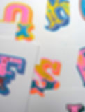
Quirks of Risograph.
Risograph is beautifully weird — and that’s exactly why we love it. Below are a few things to know (and embrace) before you hit print.
Risograph Colours & Overprinting
Riso uses spot colour inks — not CMYK. Each colour is printed separately, using a pre-mixed ink from our available colour drum library. The inks are semi-transparent, allowing them to layer beautifully.
Want orange? Try layering red and yellow. Dreaming of dusky purples? Try blue over fluorescent pink. The results can be unpredictable, but that’s where the magic happens.
Not sure what to choose? We’re happy to help, and you can also check out our colours.
Registration (aka Alignment)
Each colour layer is printed in its own pass, so slight misalignments between layers (aka misregistration) are completely normal. In fact, it’s one of the reasons Riso prints feel so alive.
We do our best to keep things lined up, but part of the process is embracing a little wobble. Think of it like screen printing’s cheeky little cousin.
Printable Area
We print on A3 paper (420 × 297mm), but due to how the Riso grips and feeds the sheet, we require a 5mm unprintable margin on all sides.
Final artwork should sit within 410 × 287mm — unless you plan to trim your work down.
Duplex (double-sided) printing is available, but expect more variation in registration and alignment front-to-back.
Riso Imperfections — and Why We Love Them
Riso isn’t about perfection — it’s about charm. Here’s what to expect (and celebrate):
-
Ink smudging – the soy-based ink doesn’t fully dry, much like newspaper ink
-
Misregistration – colour layers may wobble slightly when stacked
-
Uneven ink coverage, especially over large, flat areas
-
Roller marks – faint tyre-like streaks caused by multiple passes through the machine
We work hard to minimise these quirks, but they’re part of the beauty of Risograph. If you’re after sharp, clinical precision, this may not be the process for you.
But if you love bold colour, texture, and a bit of handmade magic — welcome aboard.

Photo & Full Colour Printing
Risograph can print photographic images, gradients, and full-colour work — but it’s not the same as digital or CMYK printing.
Instead of mixing inks like a traditional printer, Riso uses separate spot colours, layered one at a time. To achieve a full-colour effect, we break your image down into 2–4 colour layers (usually from our Riso colour library), using halftone dots to simulate shading and tone.
Want a vintage zine vibe? Or a dreamy, lo-fi art print? Riso gives photographic images a beautifully gritty, screenprint-like texture. Just don’t expect pixel-perfect photo replication — this is more film grain than 4K.
Need help separating colours? We can do that — just ask about our file set-up service.


Finishing
Want your prints trimmed, folded, or packed up ready to go? We’ve got you covered.
We offer the following finishing options:
-
Trimming – to custom sizes within A3
-
Creasing & folding – for zines, leaflets, and booklets
-
Hole punching & binding
-
Packing – we can wrap, stack, and box your prints however you need them
Got something specific in mind? Just get in touch — we’ll let you know what’s possible and give you a custom quote if needed.
Artwork Set-Up Guide.
Getting your files Riso-ready doesn’t have to be stressful — here’s everything you need to know to get the best (and boldest) results.
One File Per Ink Colour
Because Risograph prints one colour at a time (like screen printing), we need one greyscale file per ink colour.
-
Name each file by the ink colour — e.g. mediumblue.pdf, fluoropink.pdf
-
A3 size (297 × 420mm), 300dpi
-
No bleed or crop marks unless agreed — we trim manually
-
Save as PDF
-
Include a full-colour mockup so we know what you’re aiming for
Pro tip: Set up your layers colour-by-colour from the start — it’s a pain to separate them later if you’ve flattened your artwork!
What Software Works Best?
You can use:
-
Illustrator, Photoshop, or InDesign — ideal for easy layer control
-
Procreate — works beautifully for layered artwork, just export each colour layer separately
Texture, Halftones & Grain
No need to fake a print texture — Riso brings its own magic.
-
Our default setting is ‘grain’, which gives a soft, natural texture
-
Feel free to set your own halftones or textures manually in your artwork
Text & File Tips
-
Flatten or outline your fonts before saving
-
Minimum text size: 6pt
-
Vector-based files (PDFs) give the sharpest results
-
Set black elements to:
-
HEX #000000
-
Or 100% K
-
Save in greyscale or RGB (avoid CMYK for black — it tends to come out murky)
-
Riso reads tone like this:
-
100% black = 100% ink on paper
-
50% black = 50% ink on paper
It’s a bit like building your own screenprint, one layer at a time.
Need a hand?
If this feels overwhelming, we offer a File Set-Up Service to help turn your artwork into print-ready perfection — see our Design & Artwork page for details.